When it comes to mobile browsing, it should always be about the user experience. More and more people are consuming content on mobile devices, making it imperative that brands and businesses either have a responsive site, or a site that is optimised for mobile devices.
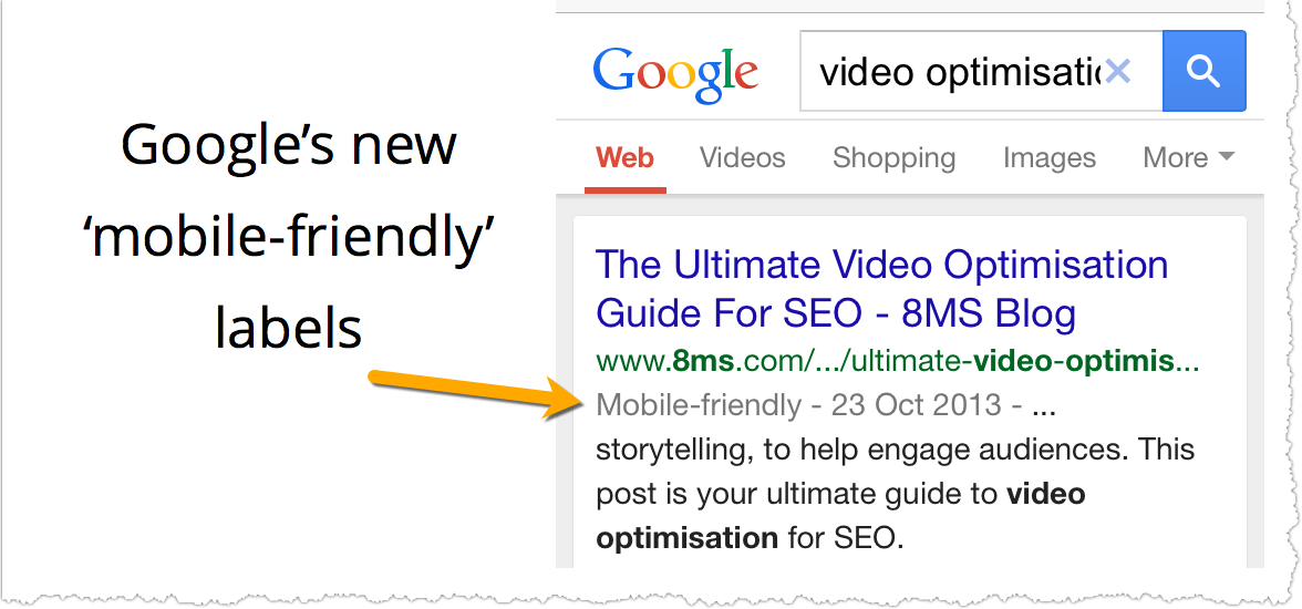
On 19th November, Google announced that is was introducing new ‘mobile-friendly’ labels into the mobile search engine results pages (SERPs) to indicate which sites are optimised and designed for mobile devices.
Aside from constantly having to pinch and zoom in, or stretch and zoom out, Google is also clamping down on sites that use Flash, sites that don’t use auto-scaling text, and sites where the navigation links are too close together.
We’ve long been advocates of responsive design. Despite this new ‘mobile-friendly’ label, you would think a lot of big brands would be ahead of the game when it comes to mobile browsing, right? Not necessarily. Our airline study earlier this year found that 22% of the top 50 airlines in the world had no mobile website whatsoever. A similar study conducted by The Search Agency found that only two of the FTSE 100 companies use responsive design, and over half don’t have a mobile specific version of the site.
Yet despite Google’s push for a great mobile user experience, many brands simply can’t afford to change, tweak or upgrade to a new site that allows for smartphone browsing. Whilst larger brands may have a mobile-friendly design in the pipeline, it is the smaller business that could suffer. Whilst the new mobile friendly logo may not be too prohibiting, if Google introduces mobile-friendly criteria into it’s ranking algorithm, business could suffer a loss of rankings, traffic and ultimately revenue.
Google have offered a number of resources to help websites meet these new mobile-friendly guidelines. These include a mobile testing tool, and a recently updated Google Webmaster Tools area to include a mobile usability report.
All the links for the resources can be found below:
- Google’s Mobile-Friendly Test site
- Updated documentation on their Webmasters Mobile Guide on how to create and improve your mobile site
- Check the Mobile usability report in Google Webmaster Tools
- Google’s how-to guide for third-party software like WordPress or Joomla, to use a mobile-friendly template
Want more inspiration on transmedia content that works brilliantly across all devices? Check out the BBC’s iWonder series, and also this amazing, immersive view of SWISS the airline.