Mobile has always been high on Google’s priority list. Ever since Eric Schmidt introduced a ‘mobile-first’ mantra back in 2010, Google have preached about the importance of mobile.
Many companies sat up and listened. Others waved away chants of “this is the year of mobile!” and did nothing. Others began ensuring their mobile websites were future-proofed, and began rolling out responsive design in order to ensure their websites responded to iOS and Android browsers.
Dubbed ‘mobilegeddon‘, the 21st April marks the biggest change in mobile to-date. More people around the world are using mobile devices to access the internet. Google – with it’s aim to organise the world’s information and present the most relevant results to those users – are about to update their algorithms to adapt to that mobile usage pattern.
SO WHAT IS HAPPENING ON 21ST APRIL?
Google want to present more mobile-friendly sites and content in their search results. As such, they are making two big changes on 21st April.
1) Expansion of mobile-friendliness as a ranking signal
Starting on 21st April, Google are going to expand ‘mobile-friendliness’ as a ranking signal. Previously Google added ‘mobile-friendly’ labels to mobile browser friendly content. As Google’s aim is to present the most relevant search results to mobile devices, their algorithms will now further optimise results against this ranking factor.
2) Surfacing app content in the SERPs
Sometimes the most relevant information is contained in an app, and not a webpage. Google understands this, and will begin to use information from indexed apps as a factor in ranking for signed-in users who have the app installed.
For more information, here is the official Google blog post: http://googlewebmastercentral.blogspot.co.uk/2015/02/finding-more-mobile-friendly-search.html
I ALREADY HAVE A MOBILE OPTIMISED WEBSITE. I’LL BE FINE, RIGHT?
As with any Google algorithm update, many companies may see adverse affects they may not have foreseen. Google (and the team at 8MS) have always recommended responsive design, to ensure content is served in the correct format, for the right device.
But…it is important to note that whilst responsive design ensures your site is ‘mobile-friendly’ it doesn’t necessarily have a ranking benefit. Regardless of whether you have a responsive site, or a separate mobile site, we would recommend using Google’s Mobile-Friendly Testing tool to ensure your mobile site adheres to their Best Practice Mobile Guidelines.

WHERE ELSE CAN I CHECK?
As with any big algorithm update, your eyes should be glued to your Webmaster Tools, and specifically the section on Mobile Usability. This can be found under the Search Traffic tab.
Another important note is that Google’s new ranking factors will impact your site on a page level. As such, it’s also worth bearing in mind other ranking factors, such as image compression and minimising payload (both to help page speed).
IS THERE ANYTHING ELSE I NEED TO DO?
The bottom line is you should focus on making your website user-friendly, helpful, and relevant – for desktops and mobiles – and you will have the opportunity to rank in Google organic search, for all types of device.
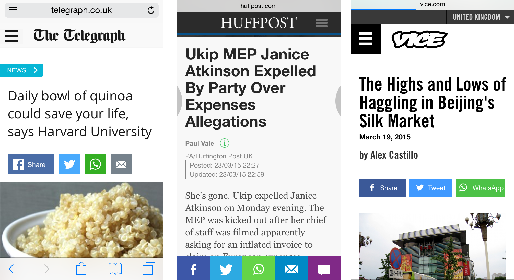
Although it doesn’t directly affect your Google ranking, another trend we’ve spotted over the last few months is the introduction of a ‘share on WhatsApp‘ button on many news and publishing sites. Millennials in particular are sharing stories and content privately across WhatsApp, so it makes sense to monitor mobile content consumption trends and ensure you keep ahead of the curve.
Need any help or advice for the impending ‘mobilegeddon’? Give us a shout below, or through our Contact Us page.